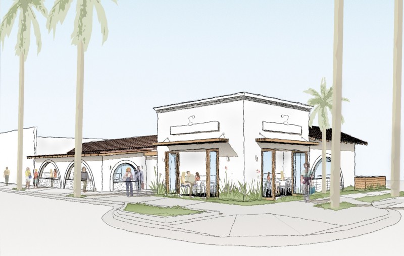
Our design for the former Tony’s Restaurant in Carpinteria was well received by the Carpinteria Architectural Review Board!
If you follow us on Instagram or Facebook you may have seen some images of this project earlier in the design process. Now that the project has had a warm reception we wanted to share the some of the ideas, challenges and opportunities with the project.
This iconic building in the center of the seaside town of Carpinteria is due for a major facelift. The interior is dark, dated and the exterior is not inviting. We were asked to help the new owner breath new life into this ideal site for a restaurant on this intersection. The challenges are many; the building is constructed of concrete block and heavy timber roof framing, the restrooms do not conform to current code, a portion of the restaurant dining area is raised not allowing disabled access and the back patio is surrounded by a tall fence making for a claustrophobic dining experience. Really it’s a case study of how not to design a restaurant.
Our approach was to strategically open up the exterior to provide light and a visual connection for those passing by the restaurant, drawing them in with the new interior layout. The new openings create opportunities for customers to see and be seen, drawing more people in off the street. A new larger patio at the rear provides additional opportunities for outdoor dining. We have also added a bar that also opens up onto the rear patio making for yet another reason for people to visit and stay.
We are currently working with the City to resolve all the issues that come along with old restaurants, like calculating historical parking use versus current use and setback issues. Not so exciting I realize but a lot of work goes on behind the scenes to make all the pieces of the project fall into place.
Check back in soon for more on this challenging project!


